


Get Jozo Breaks Free from Stereotypical Soy Sauce Packaging

March 6, 2025
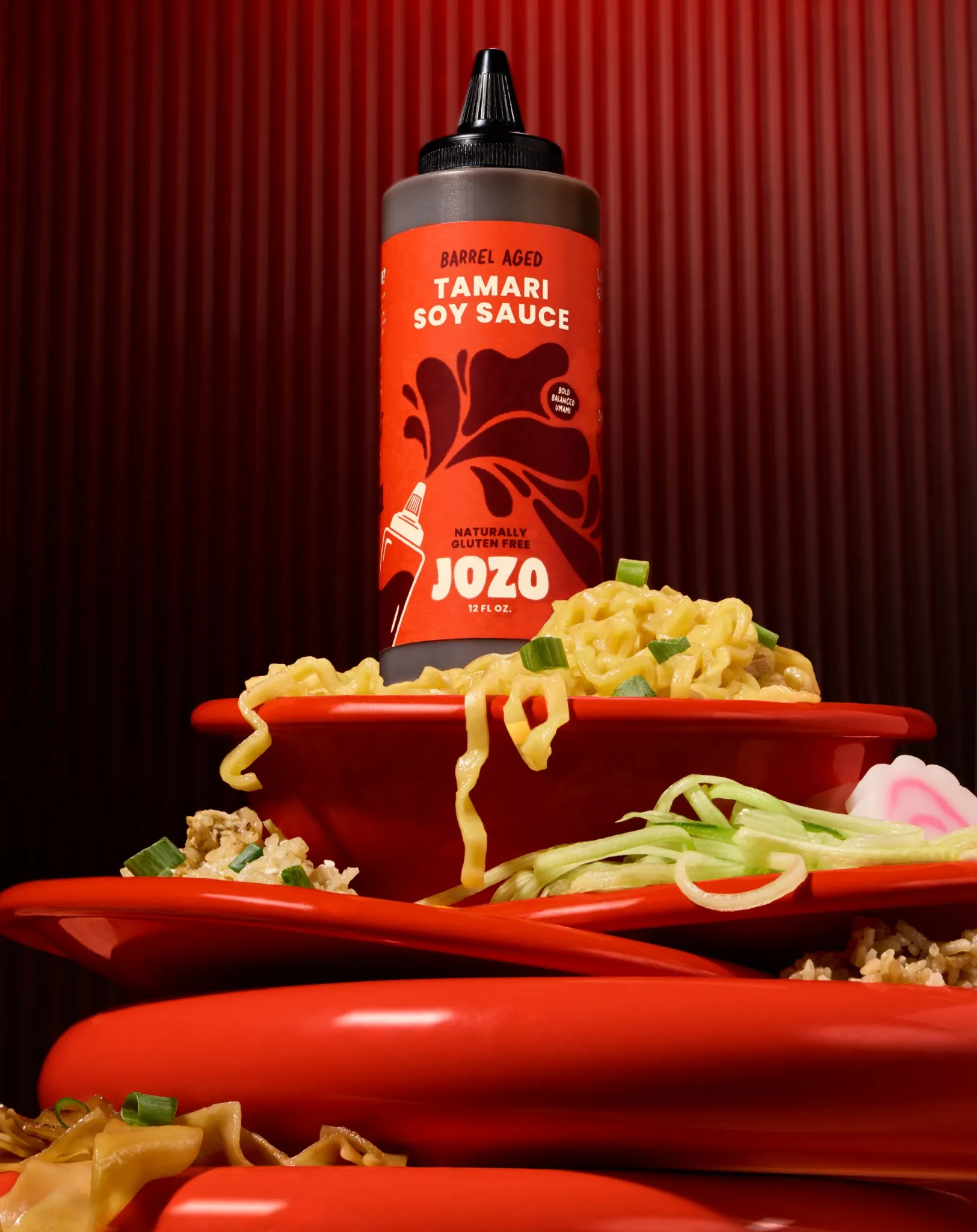
"The packaging for Get Jozo, designed by Wonderkind, brings an unexpected energy to the soy sauce category. The typography is chunky and confident, with the brand name 'Jozo' sitting prominently in a strong, sans-serif typeface, reinforcing its presence.
The squeeze bottle format is emphasized with an illustrated version of itself on the label, playfully interacting with the sauce splash graphic, hinting at the experience of using it. The overall layout is structured yet dynamic, allowing key product details like 'barrel-aged' and 'gluten-free' to be highlighted without disrupting the visual impact. The color palette leans into rich, deep reds and contrasting off-white text, emphasizing an unexpected intensity in the soy sauce aisle."
Hotlist 2025: The 25 Most Popular Design Studios, as Voted for by Their Peers
.png)
October 28, 2024
"In a world overflowing with creativity and design innovation, there are thousands of outstanding design studios to be inspired by. Some of these make a lot of effort to publicise their work; some tend to hide their light under a bushel. Others, meanwhile, would love to shout about what they've created, but their clients frustratingly forbid it.
In short, any attempt to compile a list of the 'best' design studios based on our own personal preferences would be highly subjective and wildly controversial. So, instead, we decided to keep our personal opinions to ourselves and ask hundreds of designers across the industry to vote for their favourite graphic design studios today.
The results are now in, and here they are. We've listed the design studios that received the most love in order of popularity, and we also give honourable mentions to those that narrowly missed making the list of 25."
What Does Packaging for a Mood Boost in a Can Look Like?
September 18, 2024
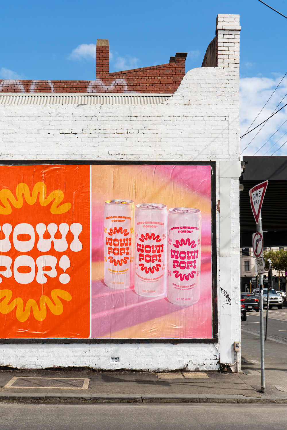
"Wonderkind‘s packaging design for WOWIPOP leans into the brand’s retro, mood-enhancing vibe through playful typography and a vibrant color palette. The bold, funky lettering and warm, poppy colors are meant to reflect the energy of kava, the mood-altering ingredient, while simultaneously supporting a clean, simple look. This balance between playfulness and sophistication gives WOWIPOP an elevated yet approachable aesthetic, a balance that’s often hard to come by in the supplement market.
'WOWI is right. Brand new fun, bright, colorful, poppy, package design and photography for @drinkwowipop! Featuring kava, L-tyrosine, damiana, green tea caffeine, and ginseng, WOWIPOP gives you a mood boost in just a few sips. And now their cans have the “wow” factor to match it 😉
We wanted the packaging to keep the same mood-enhancing and psychedelic energy as the main ingredient, Kava, which is a natural mood-altering ingredient. While we did this through the retro typography, funky shapes, warm and poppy colors; we also wanted to keep the overall look very clean and simple so consumers know it's an elevated, trustworthy bevi!'"
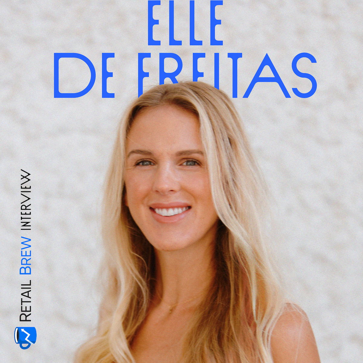
Coworking with Elle De Freitas

August 20, 2024
"Elle De Freitas is co-founder and CEO of Wonderkind, a studio focusing on social media, design, and photography for CPG brands.
'A huge part of my job is being a counselor. I give a lot of advice—naturally, about work, but a lot of personal advice is woven in. I don’t try to force a separation between work and personal lives for my team, because realistically, you can’t “turn off” your personal life. I believe leading, coaching, and cultivating a strong culture means having empathy, and holistically understanding my team’s backgrounds and situations from all angles.'"
Move Over, Barbie. Brands Are Getting Bratty This Summer

July 25, 2024
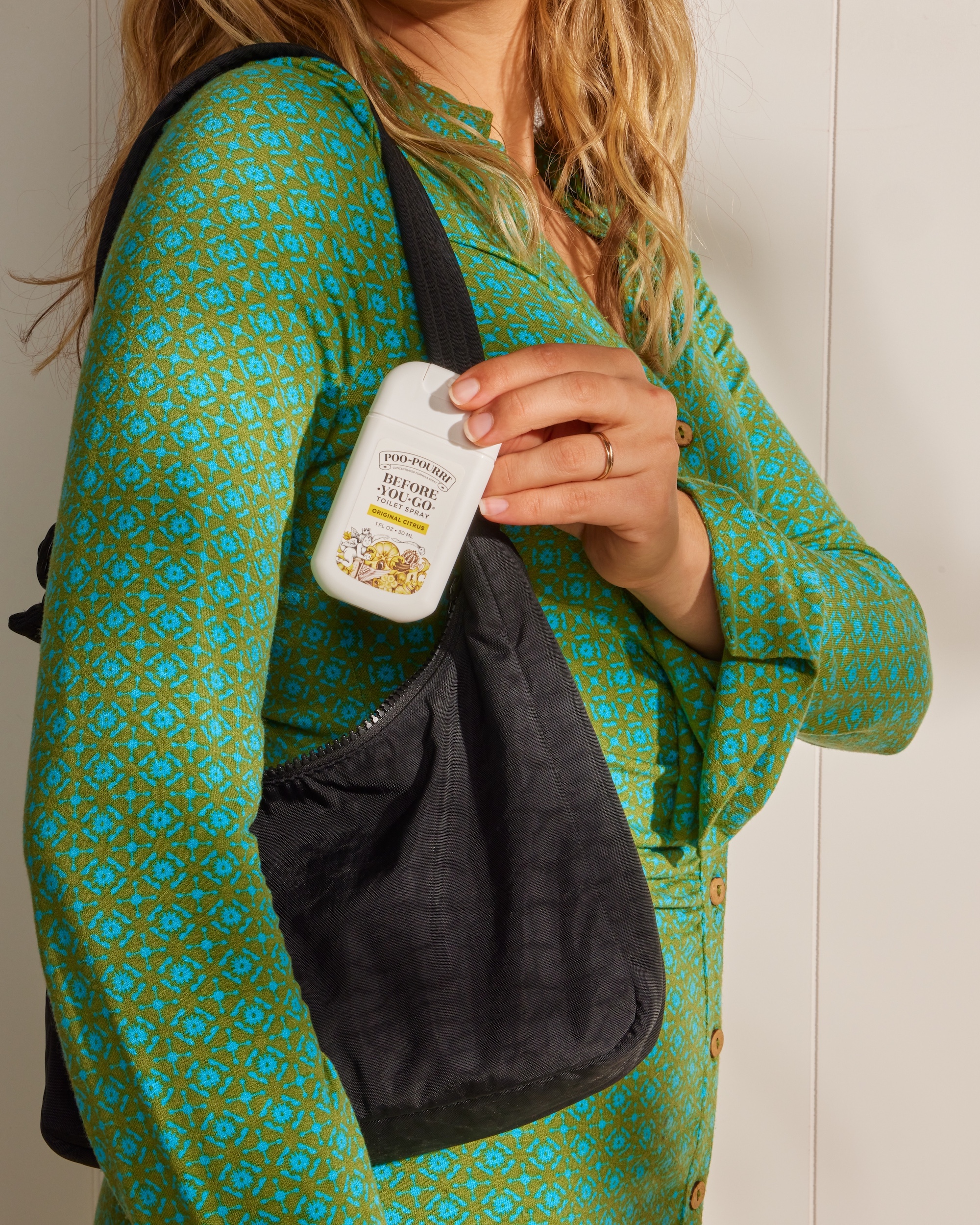
"~POURRI, maker of Poo-Pourri, shared a brat-inspired meme with the word “shat” on Instagram on July 18, which became one of its highest-performing posts of the month, while Kate Spade made a TikTok of a “brat summer starter pack” with a collection of green clothes and accessories, captioning the video “Green, the official color of brat summer.”
Consider this our best dump yet 💩 Since we’ve begun working with @poopourri on socials, we’ve seen consistent growth across both IG and TikTok. Notably on Instagram, both content & community management strategies have driven the highest engagement we’ve EVER seen — 2 million views, 285k likes, over 800 comments, and a whopping 115,000 shares on just ONE Reel! And the ~POURRI community haven’t been the only ones to take note of these wins. @incmagazine featured our quick-witted timing of taking the “BRAT” trend and making it “SHAT”, successfully taking trending pop-culture moment and making it a social win. Hailey, our creator for ~POURRI shared her insights on how we’ve channeled their target audience and made marketing magic 🪄⠀⠀⠀⠀⠀⠀⠀⠀
This brand is a fun one because it’s allowed us to reach virality in ways we haven’t seen before on the Instagram team at WK. We’ve been able to find the sweet spot, leaning into humor through reels and memes while enhancing each asset with relatable and slightly unhinged copy. Our most viral content is generally centered around two things: mega trending pop-culture moments like the Met Gala or the Olympics and relatable situations that people often find embarrassing like constipation or crop dusting. What these two have in common is that they drive engagement like crazy. The audience loves to start a conversation in the comments, send to their friends, and even share to their personal stories.
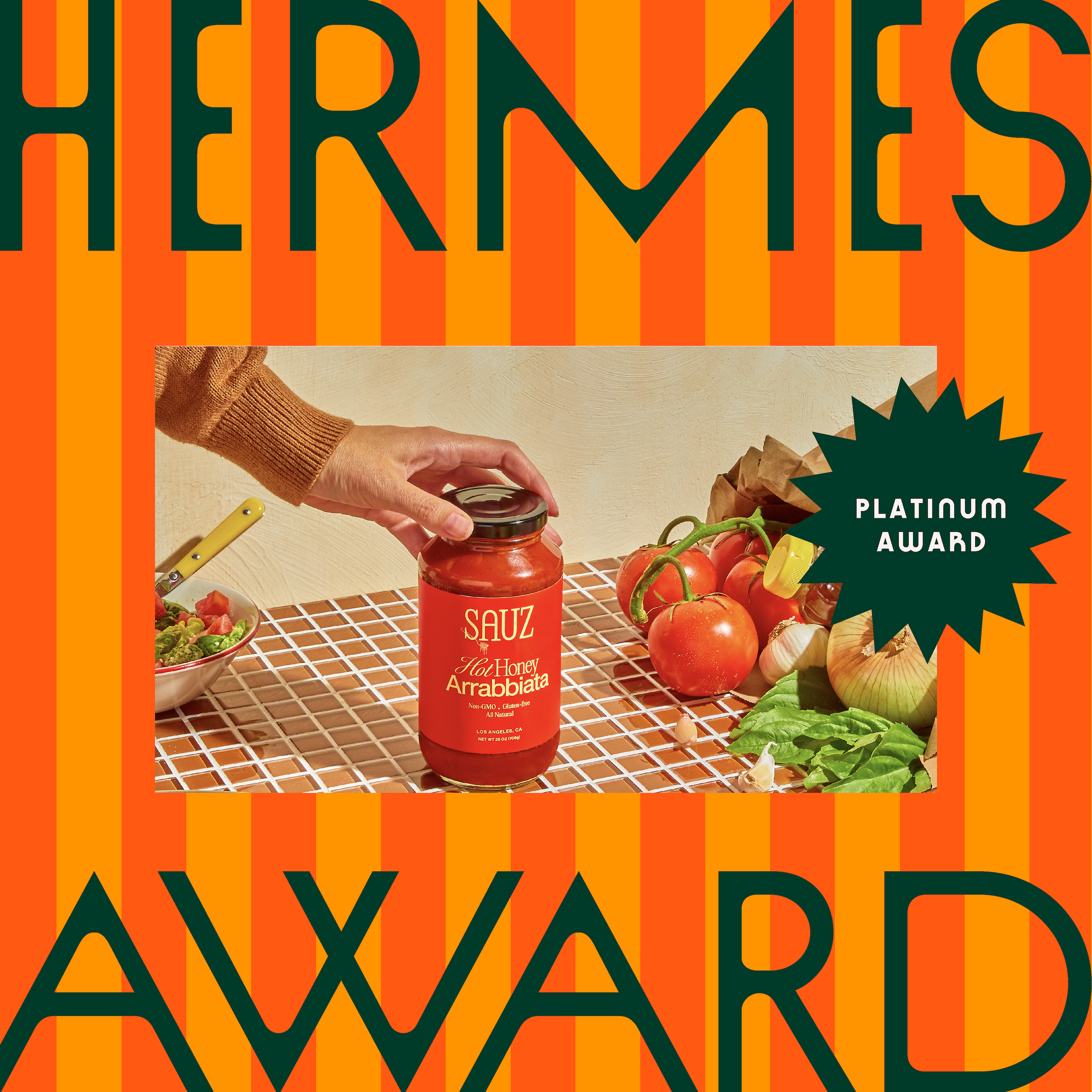
Wonderkind Co. Photography Team Winner of Gold and Platinum Hermes Awards

May 21, 2024
WE’RE PLATINUM AND GOLD AWARD WINNERS!!! 🏆🏆🏆🏆
The Hermes Awards is an international competition that awards the industry’s best publications, advertising, marketing, communication programs and more… and this year our photo team won THREE! 📸
Creating photography work for brands that is both exceptionally creative and technically advanced, our stylists and photographers work together to build captivating sets, innovative lighting, and retouching techniques to create stunning final imagery. Working with both national brands like Arizona Ice Tea, General Mills, Hippeas Snacks, Kettle and Fire, Yasso, and new up and coming brands, our photography has helped brands establish their creative voice and stand out in the CPG industry.
Throw Your Coffee a Bone with This Stylish High-Protein Drink Mix
February 19, 2024
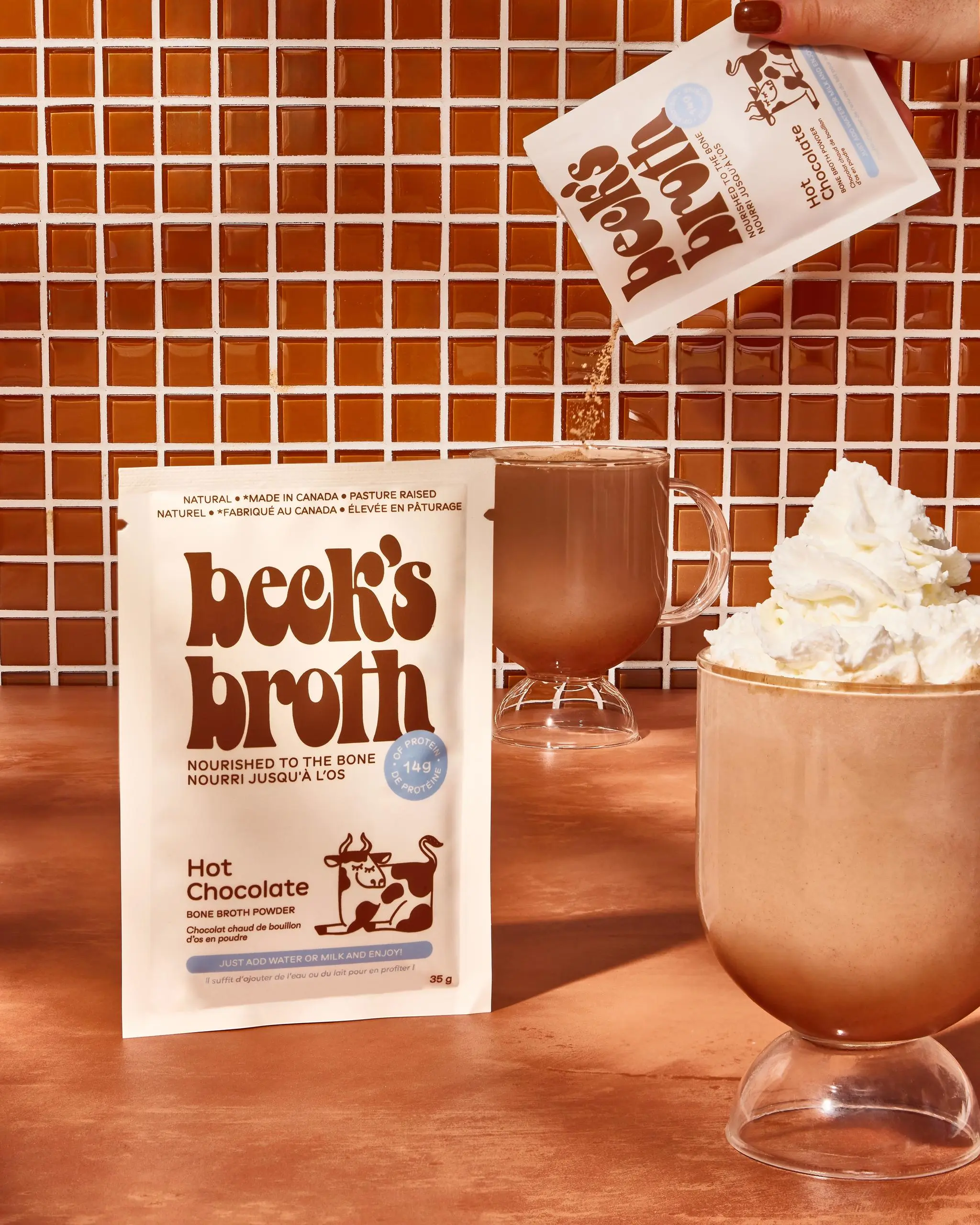
"So the vegans aren’t gonna love this, but a huge amount of science emphasizes substantial benefits to regular consumption of bone broth! With its touted ability to help with gut health, immunity, inflammation, mood, and more important everyday functions, maybe the secret to chicken soup’s nourishment has just been good bones all along.
How the hell else do you get bone broth in your diet though? I would say 'beats me,' but the geniuses at Beck’s Broth asked: why not put it in coffee? They make a protein-rich drink mix for your daily caffeine intake as well as a hot chocolate, great for kids or cozy snow days. Wonderkind gave this smart product an endearing bovine design with the chunky, youthful serif of a ’70s cereal commercial and a sweet cow curled up in the corner."
AI IRL: Why Studios Like Wonderkind are on the Hunt for Prompt Generators
November 21, 2023
“Some agencies are leaning into what’s possible and incorporating [AI] into their workflow. That’s why we want to talk to some of the best creative studios in the industry, not only about how they’re using these elements in their work, but how they feel about the future and the impact AI will have on the design industry and branding. [...] And what better way to kick things off than with Wonderkind, the Austin-based design, photography, and social media agency:
‘We’ve been experimenting with AI across all teams, in brainstorming ideas, conceptualizing, visualizing, and communicating styles with clients (a picture paints a thousand words), retouching photos, and video editing.
I see AI-driven tools as an extension of the tools we already know and love, only better. We’ll use them in all the ways we use our current tools–and perhaps in a few new ways that the old tools couldn’t help us with. With the AI functions now becoming embedded in the creative tools we use every day, we’ll be using them without a material change in our workflow.
The only thorny issue around AI should be energy consumption, and we should do what we can to encourage that to come from affordable and sustainable sources.’”
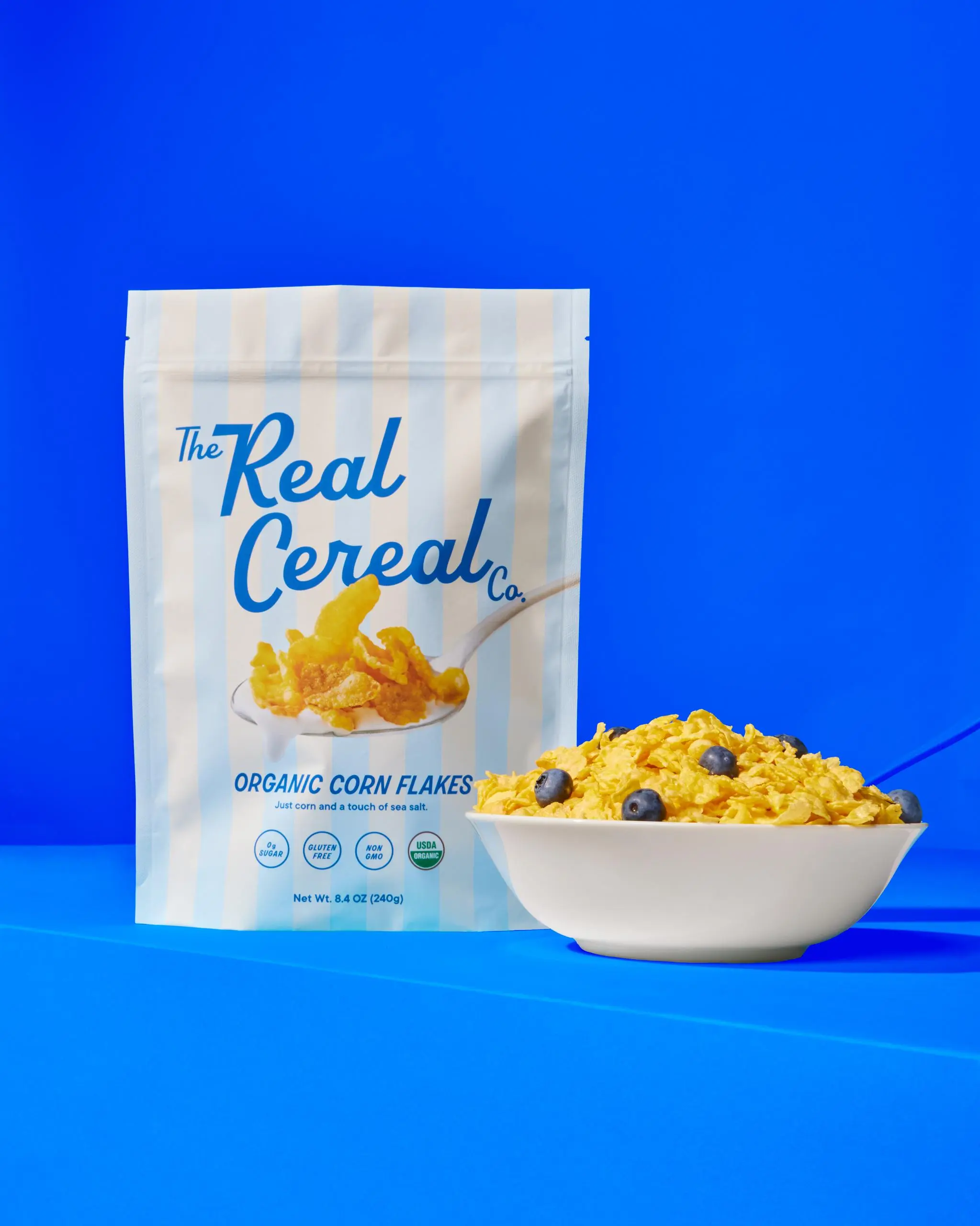
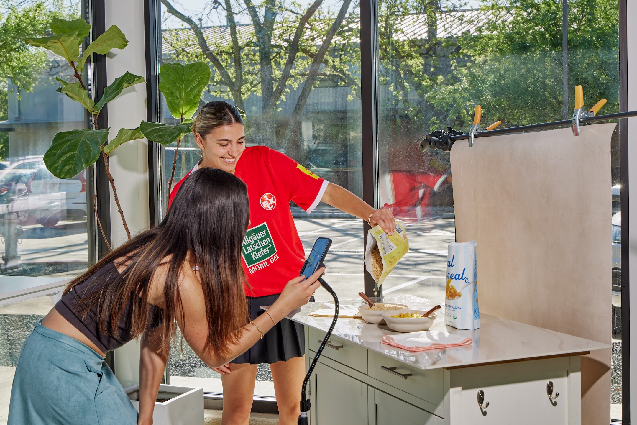
The Real Cereal and its Beverly Hills Hotel Inspiration
October 30, 2023
"Wonderkind Co.’s packaging for The Real Cereal draws inspiration from the iconic Beverly Hills Hotel. The design features a beautifully scripted font against a backdrop of subtle blue-and-white stripes and pastel colors, creating a sense of luxury and elegance. The clever fusion of a loopy, cursive typeface with a casual sans-serif font lends a unique and playful character to the packaging. Moreover, including macro photography on the spoon adds a delightful touch, engaging the consumer’s taste buds. This casual and playful design, combined with a pouch instead of the typical cereal box, effectively sets The Real Cereal apart."
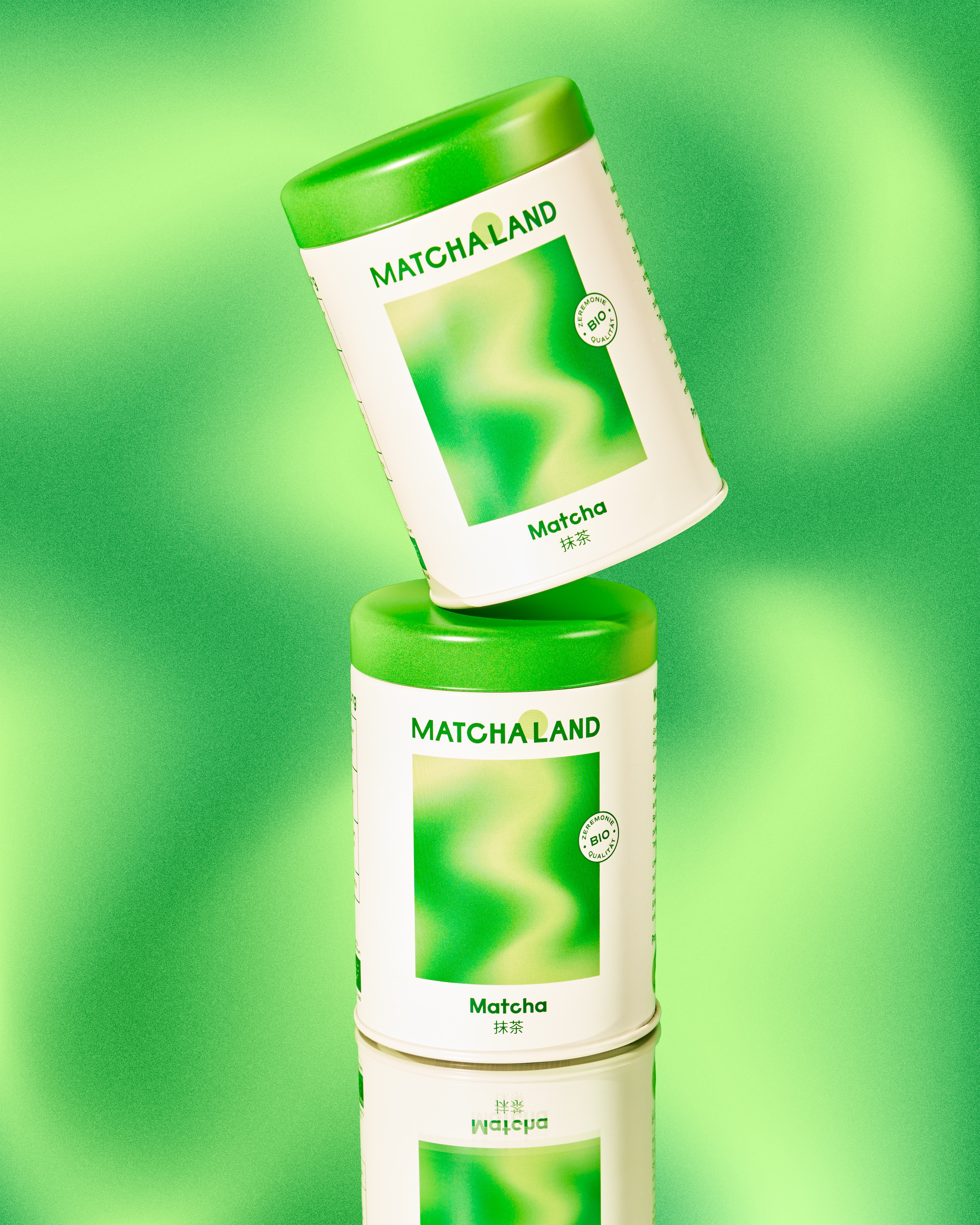
Matchaland's Packaging Embodies Tranquility and Energy Together
October 24, 2023
"Wonderkind Co’s packaging design for Matchaland gorgeously encapsulates the essence of the Japanese green tea-inspired brand. Inspired by Japanese art prints and letterforms, the packaging’s calming colors evoke a stillness. The blend of fresh matcha green and neutral tones in the brand’s color palette highlights the harmonious fusion of flavors.
The gradient artwork, mirroring the depths of the swirling motion of matcha, injects a dynamic and lively aspect into the packaging. At the same time, the vivid green pattern against the white backdrop creates a striking visual contrast. The psychedelic-inspired graphic design immerses consumers in a peaceful and zen-like experience, making Matchaland’s packaging a true embodiment of tranquility and energy in one.
'How Matchaland came to life:
Moodboard: Because it’s made from Japanese green tea leaves, the moodboard nods to Japanese art prints and letterforms with calming colors throughout.
Colors: The Matchaland brand colors incorporate the fresh matcha green we all know and love with notes of neutrals that showcase the Chai.
Logo + Brand Elements: The gradient artwork mimics the flow of the matcha in your cup, bringing movement and energy to the overall look and feel.'"
.jpg)
Adding a Sunny Disposition to a Market That's Otherwise Stagnant
October 18, 2023
"Wonderkind Co’s packaging design for The Morning Juice Co is a refreshing departure from the ordinary OJ offerings. With its cheerful illustrations and lively typography, the packaging exudes a captivating sense of nostalgia. The incorporation of vibrant yellows and oranges in the photography celebrates the essence of sunshine and orange juice and infuses the packaging with an undeniable burst of energy. The clever use of blue as a pop of color within the packaging system allows the typography on the box to come alive, ensuring that The Morning Juice Co stands out as a vibrant and innovative choice within a stale market."

Industry Watch: Meet the People Behind the Brands

September 28, 2023
"Claire is the resident photographer at Wonderkind, an Austin-based brand and social media agency. Working primarily with food, beverage, and beauty brands, she has shot for clients including newly launched Dirty Shirley, Can-Tini, Sauz, Daybird, and Nood.
Leading up to those whimsical final shots, Claire meets with brands to understand their vision for the photoshoot, then works hand in hand with prop stylists to nail down a specific creative direction, and finally brings that to life on set through styling & lighting."
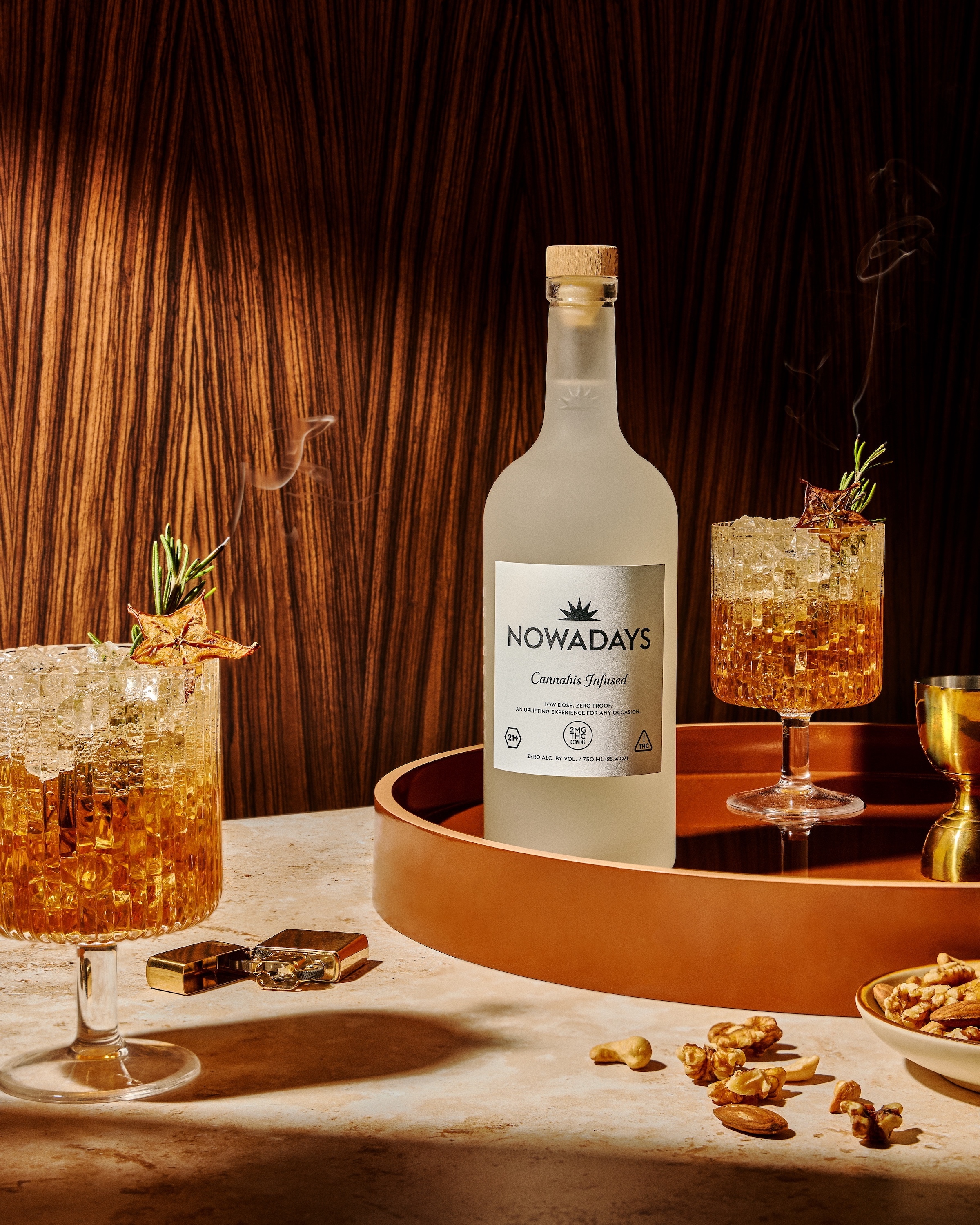
Viral on TikTok: This Company's Success Paves Way for Hemp-Based Cannabis Beverages Across State Lines

August 1, 2023
"Puterman explained Nowadays' social media strategy and how they navigate the limitations of marketing cannabis products online. Instead of directly promoting the THC-infused aspect, they focus on positioning their product as a new non-alcoholic option that offers a buzz without alcohol.
This creative approach allows them to market the product without getting banned and has resulted in a significant following on TikTok, with thousands of followers in just two months. The real-life experiences shared by consumers who try the product organically generate content, contributing to its viral success.
'On TikTok, we market the product as a new nonalcoholic option that offers a buzz without the booze. By avoiding explicit mentions of THC, cannabis, or weed, we can successfully promote our product without getting banned. This strategy has allowed us to connect with consumers who are genuinely interested in cannabis products.'"
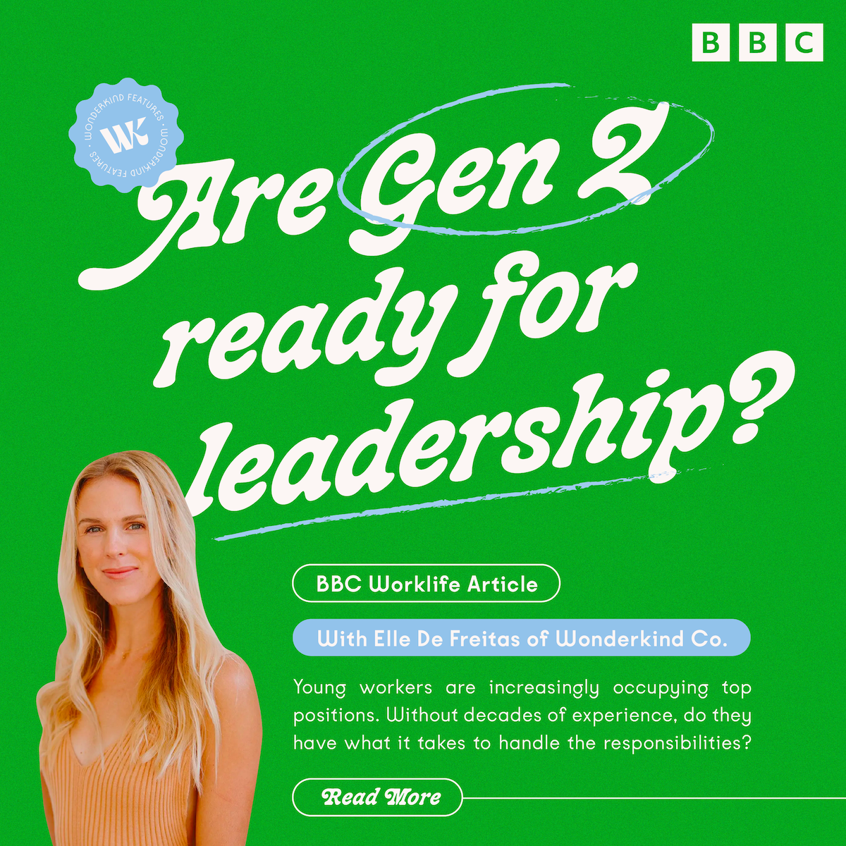
Are Gen Z Ready for Leadership?

July 31, 2023
"Elle De Freitas has the kind of jam-packed schedule you’d expect of a typical CEO running a successful social-media marketing company. As founder and head of Austin, Texas–based Wonderkind, she has meetings with her eight-person leadership team to discuss new business; calls with clients about their Instagram and TikTok campaigns; pitch sessions with prospects; and a weekly all-hands update with her 50 employees.
What makes De Freitas stand out is her age: at 31, she is younger than most chief executives, and her entire C-suite is comprised of Gen Z professionals no older than 26. It may be unconventional for such a green leader to helm a company — with such a young executive team to boot. Still, De Freitas believes she’s up for the task. Even though she often asks herself whether she’s 'qualified' or 'ready for the job,' she says, 'every good decision I make allows me to feel more confident in my leadership abilities.'"
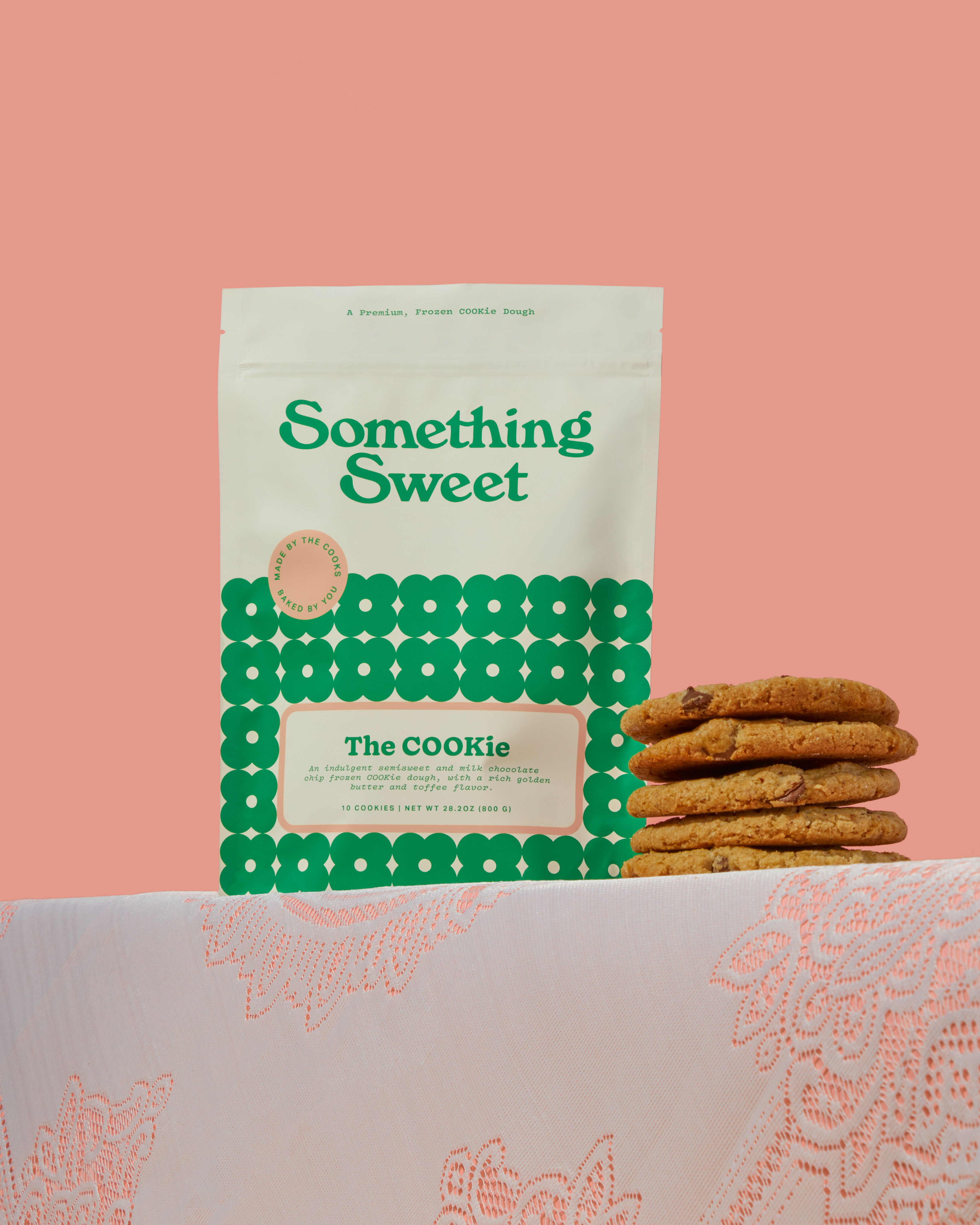
When Life Gets Hard, There's Nothing Better Than a Little Something Sweet
March 10, 2023
"Something Sweet is a brand rooted in a beautifully close family. The unfortunate death of the family’s beloved dad and husband, Dan, brought the family closer together. In Dan’s honor, the Cook family created Something Sweet to remember that when life is hard, there’s nothing better than Something a little sweet.
The brand worked with Wonderkind to create a packaging system that looked and felt as cheerful and upbeat as Dan always made his family feel. The result is a pouch drenched in pink and green hues with a flower pattern representing the brand’s family and their trust in their faith. While the brand’s history and story are beyond special, the sweet, cheerful packaging and the pouch entirely set this brand apart from the rest."
10 Studios & Agencies to Watch
December 23, 2022
"Female-led Wonderkind is a team of talented millennial and Gen Z women that have demonstrated a talent for appealing to the same demographic. The Austin-based studio has also had a banner year, creating some terrific food and beverage (F&B) branding and packaging that runs the gamut visually but is anchored in a strong, demonstrable understanding of their generation, especially women.
Jibby is CBD-infused coffee with a playful mascot, lending a lively and approachable attitude to the brand. You Again is a muffin mix that features Ayurvedic ingredients, and Wonderkind refreshed the brand by amping up the color palette, incorporating new typography, and finding inspiration in henna tattoos. Hot Take is a brand of ready-to-bake chocolate chip cookies that are indulgent and made with premium ingredients—the branding literally smiles at the consumer, and the color palette has strong mall vibes, which is a thing Gen Z is apparently really into as a retail experience.
With more members of the Z class graduating into their influential purchasing age, Wonderkind is a studio to watch if you want to see how to build a brand for up-and-coming consumers successfully."
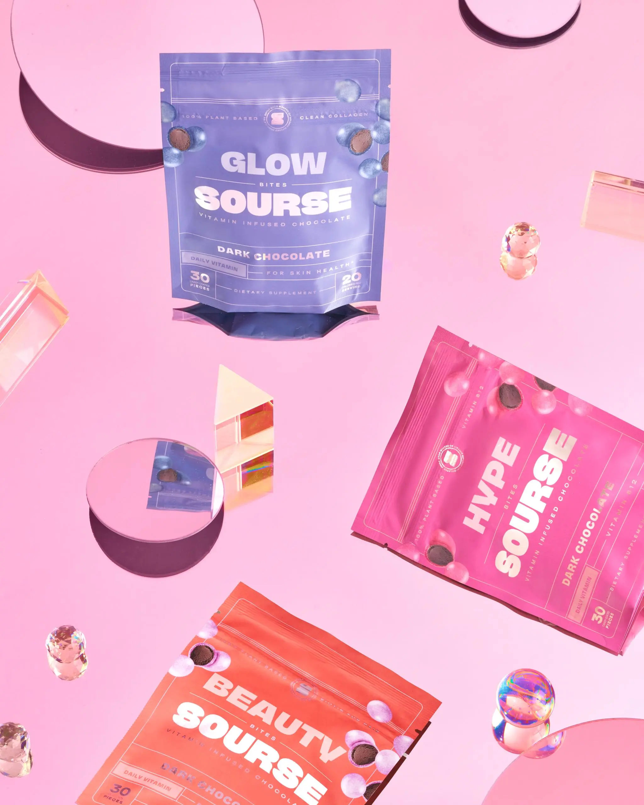
Vitamins are Now a Sweet, Delicious Treat Thanks to Sourse
September 5, 2022
"Designed by the ever-creative Wonderkind Co., Sourse is a vitamin brand that’s turning the industry upside down. The chocolate-covered vitamins are sweet, and the packaging reflects it through the glowing colors and holographic typography. Old pharmaceutical apothecary labels inspire the bold typeface and thin lines, but it doesn’t take a genius to know that these vitamins aren’t anything like those of the past. I never thought vitamins could be a treat, let alone a fun one, but Wonderkind Co.’s packaging proves me wrong.
'The package design for Sourse embodies the structure of old pharmaceutical apothecary labels paired with intricacy of decorative flourishes and typography commonly found during the 16th-19th centuries. Its classic structure achieves a trustworthy, creditable look + feel, while modern typography, luxe print finishes, and rich, warm colors give it a fresh and modern look to support their unique angle in todays supplemental beauty category.'"
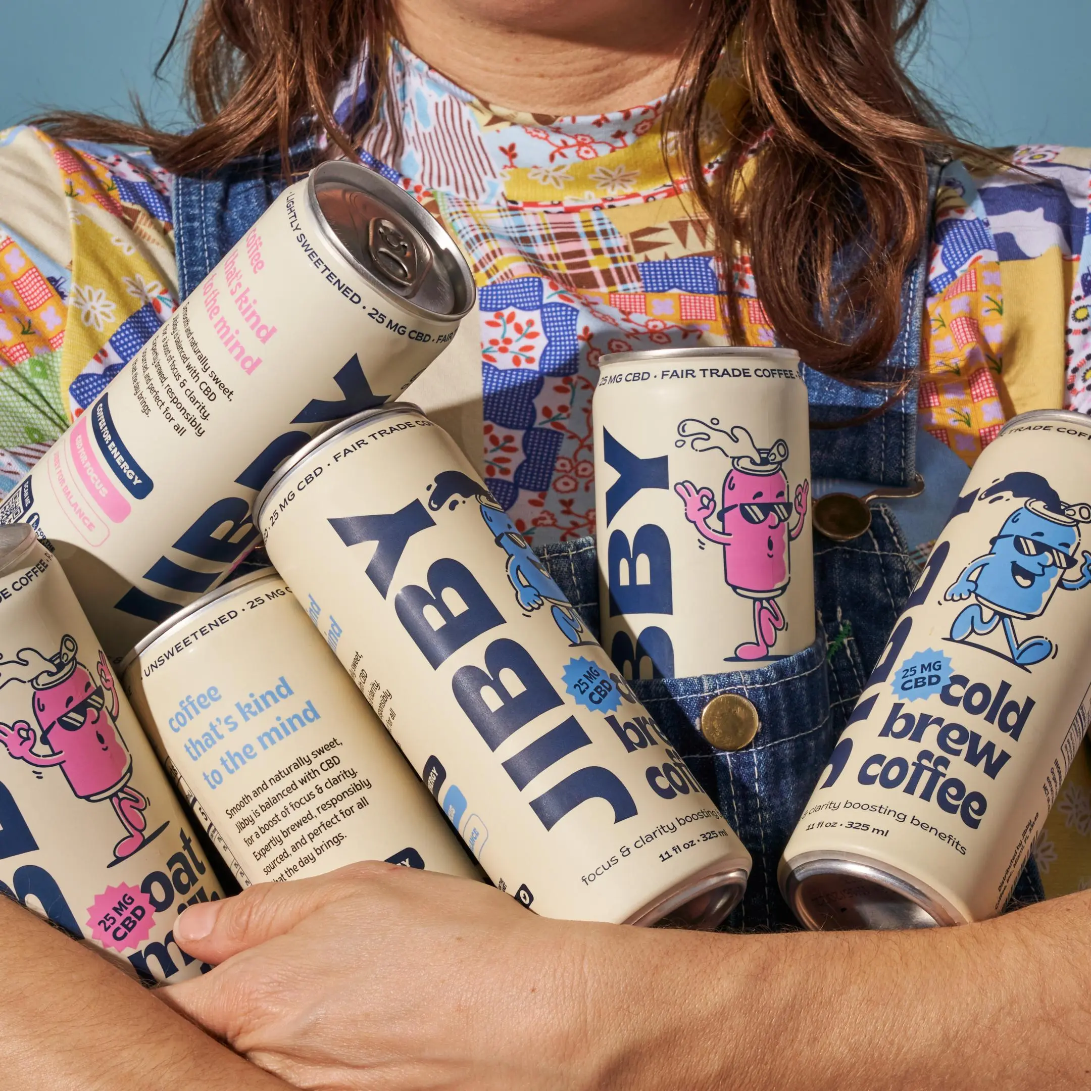
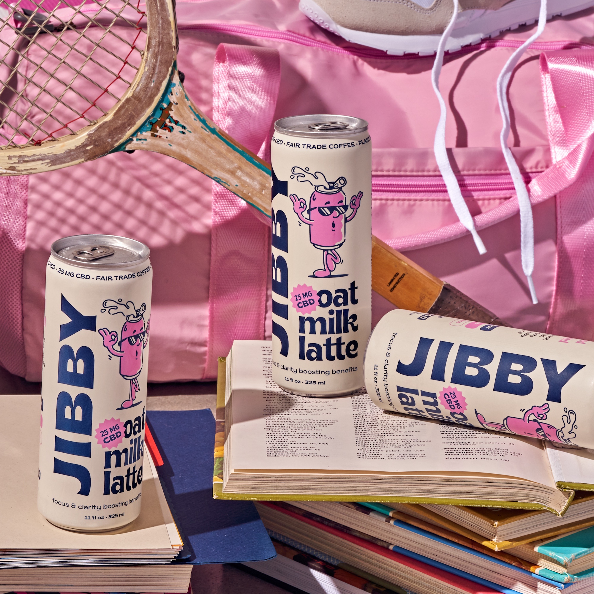
Coffee Has Never Looked This Relaxing, Meet Jibby
July 8, 2022
"While we consume coffee to make us feel energized and ready to conquer the day, the effects can sometimes cause us to feel uneasy and jittery. Jibby is a brand with packaging designed by Wonderkind Co. that helps consumers feel motivated and relaxed. The nostalgic approach to the packaging instantly constructs a more refreshing disposition for coffee. In addition, the typography and illustrations work together to create a buoyant system for a category that sometimes leans towards a stuffy aesthetic.
'Jibby approached us seeking a package refresh, to give their coffee a playful, nostalgic feel. While coffee can sometimes make you feel anxious and jittery, Jibby is redefining cold brew through a thoughtful blend that incorporates CBD for a bev that promotes energy *and* calm.
Through playful and bold typography that stands out on the shelves, a potent color palette consisting of a core cream background and strong navy + color pops to stand out against competitors— the resulting can is a whimsical objet that will make any coffee-lover swoon. We used vintage inspired illustrations that bring a cheerfulness to the pack accompanied by a color palette that is not traditional in the coffee space to help them really set themselves apart.'"
Wonderkind Helps Build Boldly Authentic Brands for Millennials and Gen Z
June 15, 2022
"While many agencies struggle to understand this burgeoning Gen Z consumer group, Wonderkind is in a unique position not only to understand Gen Z and younger millennials but can effectively bridge the gap between emerging brands and this new generation of consumers. Woman-led and comprised of millennials and Gen Z talent, Wonderkind has deftly demonstrated how to connect with the emerging group of consumers.
Wonderkind founders Elle De Freitas and Cally Burgett met in Austin, and in 2019, they were both ready for a career change. De Freitas had been working with wellness CPG brands with sales, events, and marketing, and Burgett had fallen in love with packaging and design from her decade in the wine business. They initially conceived the agency as one focused on consulting brands on their social media presence. The concept broadened to include more creative services like branding, packaging, and photography, and three months after launching, Wonderkind landed its first client."

Hot Take Cookies Wants to Be Your Go-To Indulgence When You Need a Break From Being Good
March 21, 2022
"Cookies, or biscuits in “non-freedum” English, are pretty awesome. And while many varieties exist, there is nothing like a giant, freshly-baked, soft, gooey cookie made from quality ingredients. Naturally, we shouldn’t dive into a cookie jar full of refined carbs and chocolate at every impulse, Sesame Street style, but if you’re going to be bad once in a while, make the experience good.
Some new brands embrace this YOLO attitude, creating indulgent ready-to-bake cookies meant as an occasional treat made of the best ingredients. Hot Take, previously Gooey, makes take-and-bake frozen cookie dough that seems to follow this ethos. Founded by sisters Elise and Gabrielle Brulotte, the new cookies reflect a balanced life, which usually means a mix of healthy habits with the occasional dalliance into indulgence. Hot Take uses natural and organic ingredients, avoids palm oil, and uses fair-trade chocolate, making naughty snacks less so.
The new branding and packaging by Austin neighbors and female-led Wonderkind exude fun. Gabrielle told Dieline that she and her sister Elise felt it was meaningful to work with female designers for Hot Take’s rebrand. The color palette of red, yellow, and blue gives off rad, mall food court vibes, and the logo’s use of rounded, sans typography within a broken circle with rounded edges is reminiscent of neon signs. Overall, Hot Take’s presentation is the first step towards the joy of biting into a freshly baked cookie."
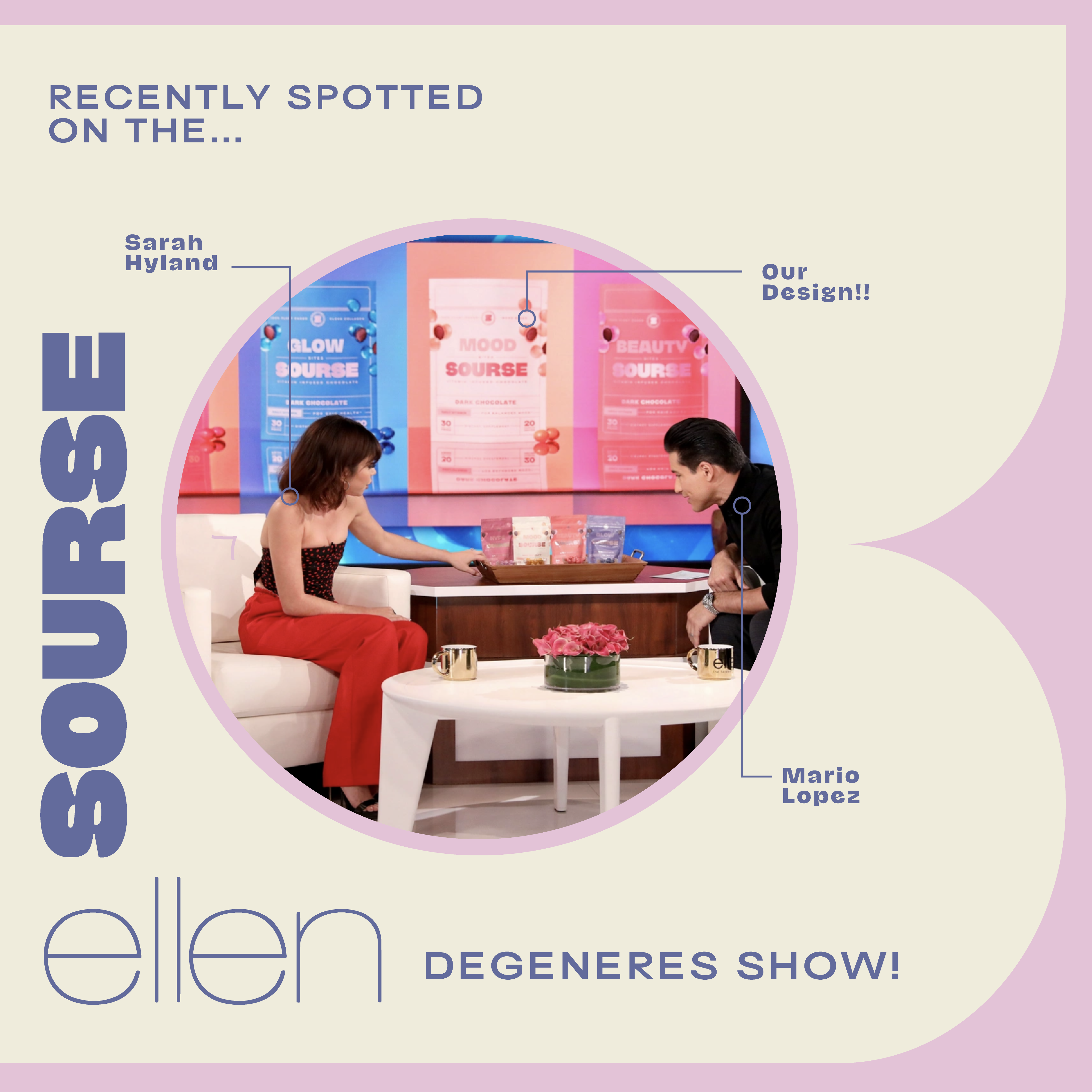
Source Designed by Wonderkind Featured on the Ellen DeGeneres Show

February 7, 2022
We are just so darn proud of our packaging design for Sourse, sittin’ pretty on the Ellen DeGeneres show!!
We’ve seen our designs on the shelves of Erewhon, billboards, a part of brand collaborations, on Shark Tank, and merch - but this one TAKES IT.
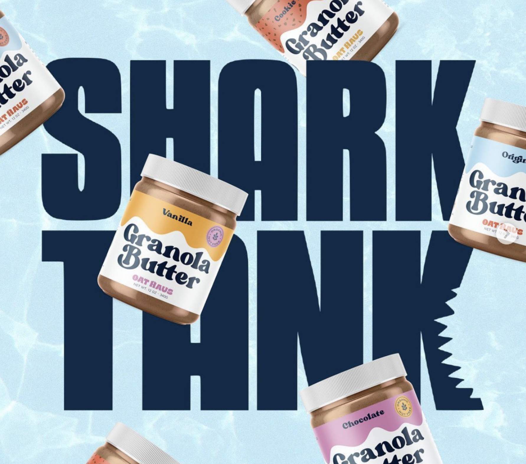
Oat Haus Design by Wonderkind Featured on Shark Tank

November 15, 2021
WOW'D AND A HALF to see our friends on Shark Tank 🦈 Can’t believe our logo and label made it on the telly. #mamawemadeit
If you don’t already know Oat Haus (first of all, fix that), they’re the nut-free snack brand behind the iconic Granola Butter — the world’s first oat-based spread. Think: the nostalgia of your favorite nut butter, minus the nuts, plus MAJOR flavor (we’re talking brownie batter, birthday cake, and a current seasonal fav: apple cider donut).We helped bring their playful energy to life through packaging that’s as smooth *wink* as the product inside. Proof that thoughtful design really goes the distance; from the Shark Tank stage all the way to shelves nation wide!
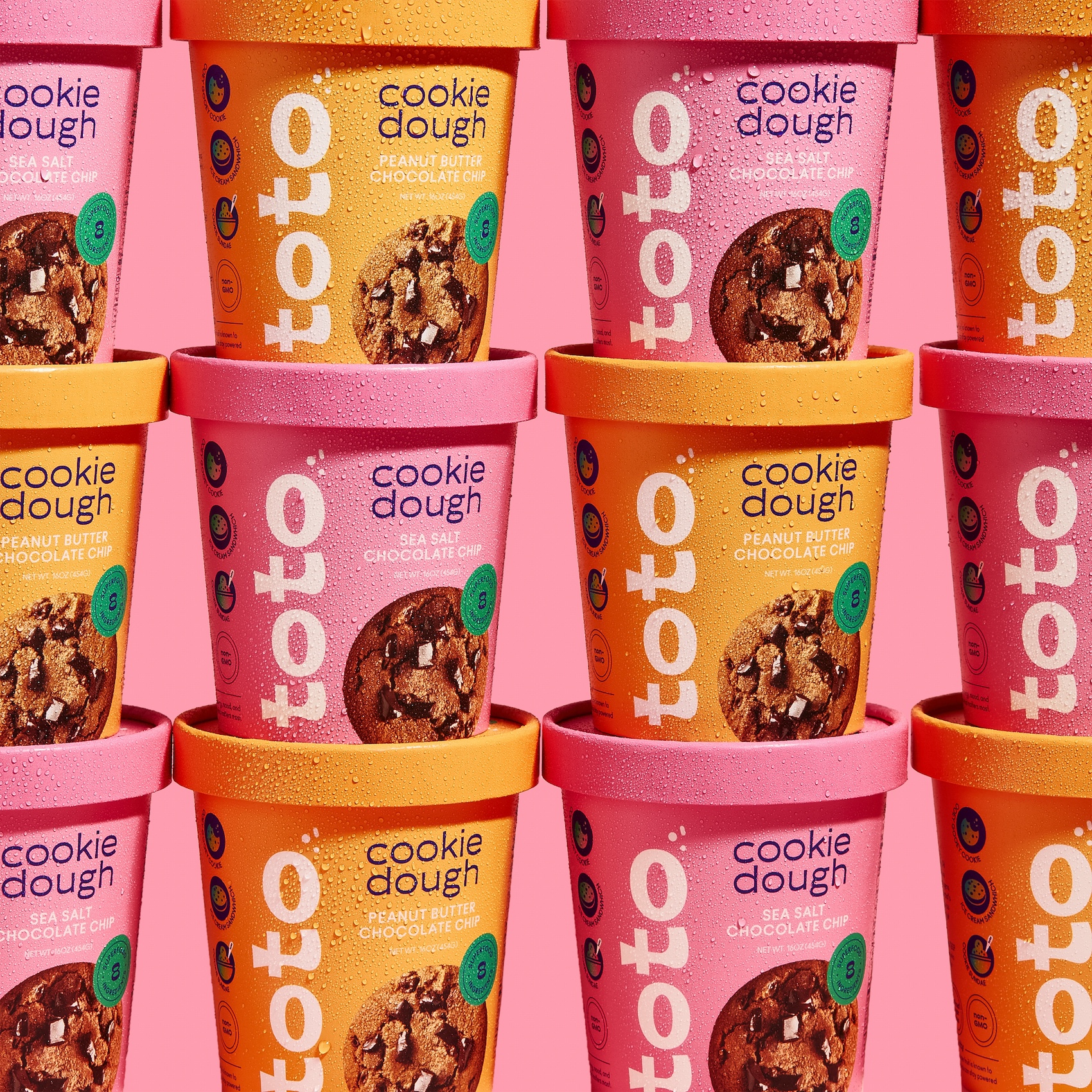
A Sweet, Sweet Design by Wonderkind for Cookie Dough Company Toto
June 22, 2021
"There are sommeliers for wine and cheesemongers for cheese, and whatever there is for cookie dough, I’m one of those. Toto’s package design is everything you could ever dream of for a sweets company: bright, lively, cheery, and easy-going. Designed by the Austin-based design studio, Wonderkind, the energetic hues of the packaging make this cookie dough carton one that pops out at you in a sea of competitors.
'Previously known as Made By cookies, Toto came to us wanting a bright, lively design that would help the brand excel next to long time leaders in a retail cookie and cookie dough environment, as well as online.
The design is a mix of clean, minimal structure, bright color and bold and playful typography. The true magic of this cookie dough comes from being made of 8 superfood ingredients, so we made this proposition easily distinguishable on all sides of the packaging. We used a lively shade of green to highlight the brands main differentiator and then extended the color application to the ingredient list on the back for easy way-finding.
This project was an absolute joy to bring to life, and now we’re looking forward to help the brand establish a social presence.'"